
Carey Wong is a prodigiously talented scenic designer who summons entire worlds onstage for major houses like the Portland Opera, the Seattle Opera, the Intiman, Seattle Children’s Theatre and a host of others. This year he’s already designed a slew of shows, including the world premiere of Cheryl L. West’s Mwindo, Cat on a Hot Tin Roof (at ACT April 17 through May 17), and Around the World in 80 Days (at the Village Theatre in Everett March 6 through 29).
This month, Wong’s work is on display at the Rep with The Comparables (running through March 29), a play by Laura Schellhardt about three women in high-end real estate. The show explores competition, empowerment and intrigue against the backdrop of Wong’s chic but forbidding set. I joined him on the Bagley Wright Theatre stage, where he walked me through some of the aesthetic and practical choices that went into creating this convincing representation of the steel-and-glass world of cosmopolitan, cutthroat business. Wong speaks softly and thoughfully, explaining his process with the clarity of his thirty-plus years in the business. The following words are his.
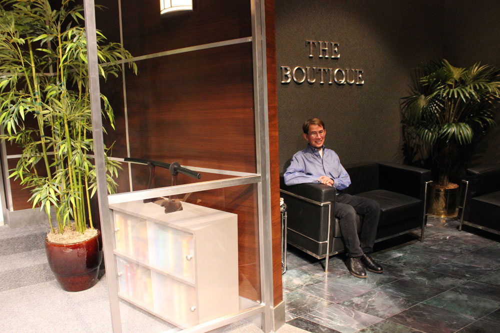
“We started out with just the description of the environment in Laura [Schellhardt]’s script: a very high-end real estate office on the Upper East Side. She wanted it to exude a sense of wealth and confidence and a hierarchy. The environment we wanted to create was a very masculine one—solid, sober, no frills, very little femininity—to give a sense of the world that Bette, the proprietor, had to create to get ahead.”
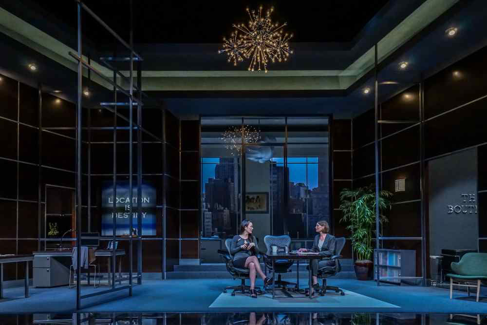
“For the research for this show [director] Braden Abraham and I looked at a lot of pictures of metal and glass skyscrapers, both inside and out. One image we were drawn to was an image of a very dark office in the foreground leading to a very light, bright and vibrant white office in the background. Another image we were drawn to was an office that had not only glass walls and glass ceiling but a glass floor. So we wanted to combine those two images, and what we did was create this glass surround that suggests skyscrapers. It actually lights up and illuminates as a picture frame, and the women can step out of the world of the office by standing on this and being lit separately.”
“The rest of the office, we followed that idea of making a dark foreground with this wood paneled veneer and having this white office that Bette occupies upstage. To create that expensive world of this environment, we tried to furnish it with really nice furniture: black Barcelona chairs and the Design Within Reach glass desk in Bette’s office, the Eames chair, and some Mirra chairs from Herman Miller around this conference table.”
“In Bette’s office are some riffs on Josef Albers graphic drawings from the 40s that complement her office and make it very geometrical. We also wanted to provide a couple of things that soften this office, so there’s the Degas drawing in the center and the plant and these two lighting fixtures we built: the ‘Sputnik’ one downstage that looks like a starburst and the more organic one in her office are softer things that give it more style but also break up the hard lines and hard edges and the angles.”
“One image that is really prominent in this show is a goldfish bowl. It’s talked about as a world that delimits the fish, and in some ways this office also functions as a goldfish bowl; it has both its possibilities and its limits. So this ‘Sputnik’ lighting fixture was also appealing to us because it also resembles air bubbles, maybe that’s an extension of the goldfish bowl metaphor which is so potent.”
“We also were dealing with this huge stage at the Bagley Wright and it’s a three-person show, so we wanted to find a way to make it more intimate. To push the action closer to the audience, I decided to angle the stage forward. The challenge of working in the Bagley Wright, for me, is that the audience seating can start out very low in the theatre and if the [stage] floor is flat, actors even fifteen feet upstage seem really far away. So if you tip the angle of the stage a bit, you create a dynamic, an energy, and it allows the audience to see the movement and choreography. It’s an expense, so I try to use it judiciously when projects require it, but I’d say I probably use it on a quarter of the shows I design. It’s very effective.”
“The other thing we did to get the action to move closer to the audience was to create everything in forced perspectives. The verticals are true verticals but the horizontals are actually diagonals. This creates a greater sense of scale, so the human figure can appear to be very present. We’ve also crafted desks that are designed in forced perspective, where Iris and Monica work. The height of this room looks much bigger than it is by being in forced perspective.”
“All of that is resolved in Bette’s office upstage, which has a flat floor. It has some forced perspective in the ceilings but not in the walls, so hers is an island of peace and calm and light and niceness slightly elevated from this world where a lot of the action and a lot of the deals are made.”
Keiko Green and Cheyenne Casebier onstage. 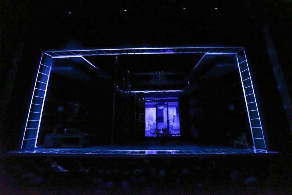
The glass surround illuminated. 
Linda Gehringer steps into the glass surround. 
Bette’s bright office. 
The “Sputnik” lighting fixture. 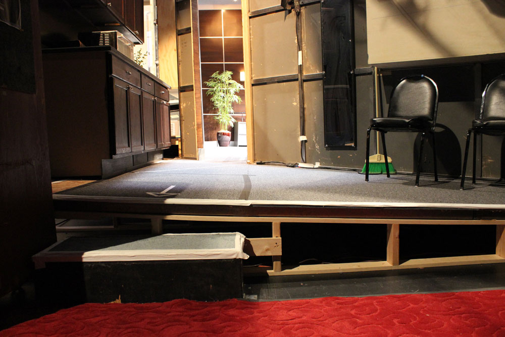
Angle of the rake as seen from backstage. 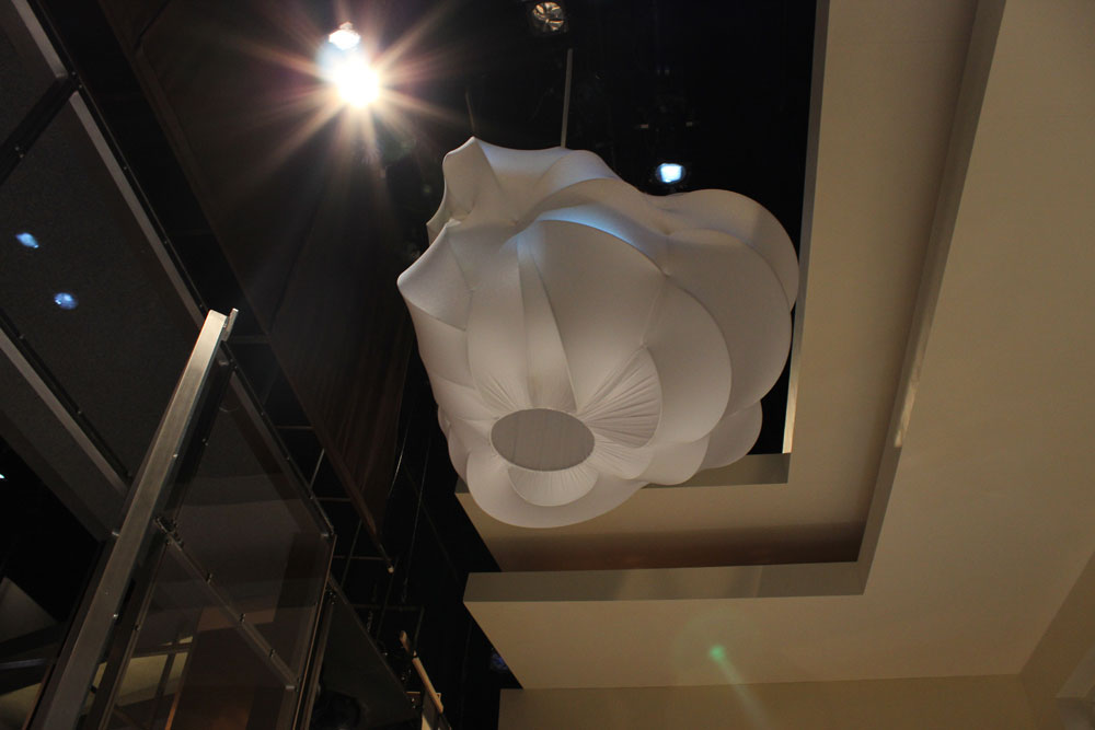
The organically shaped fixture in Bette’s office. 
Monica’s desk with forced perspective angles.